Designing for people that will be using this website – that’s you!
By Bobi Robson on behalf of the Aye Mind collaborative
We began the re-boot project for Aye Mind with a big objective: learn from what we had done before, and have conversations with the community who will be using the site to really understand what you need from it (and our wider service).
In this blog, we’ll be sharing the process that we followed – known as user research – to listen to you about what you wanted. We’ll cover what we did in these key steps of developing the site, and will share some tips in case you’re thinking about doing some user research of your own for a service or project.
Where did we begin?
First, we agreed on what our key assumptions were and which of those were the riskiest. These were the beliefs that we had about people who would be using the site that we didn’t have any evidence for – they might have been based on our personal experience or just having a ‘hunch’ about things. If we ran with these ideas before finding out if they were true or not, they could lead us to design something that really didn’t help, so it was important we identified them.
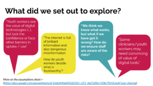
Once we knew the big questions we wanted to answer, we could then start to have conversations with our community. This next step saw us testing out our assumptions and starting to gather evidence about whether they were right or wrong. We spoke over video call to 5 people working in youth settings including project coordinators, digital officers, and those specifically focussing on distress responses.
We learned about the difficulties that using digital tools can bring:
“[Digital meant that I was] parachuting into someone’s bedroom [that] worried me”
The middle ground that’s needed:
“Balancing face to face interactions with digital is very important to make sure the connection is not lost between people.”
And the positives of using digital tools too:
“When the young people we support live in remote areas, accessing us in person can be difficult. Creating a digital option gives them a way to access support.”
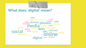
Whilst we were having these conversations, we also had a survey live. This was completed by over 100 people and looked to find out what our community understood ‘digital’ to mean for them and their work with young people, what barriers they face to using digital tools, and what could help. We used this to test the assumptions that we identified at the start of this process and to make sure that the information we shared on this website was easy to find on a web search and that it was practical to use.
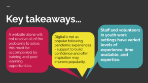
All of this work gave us a lot of insights into what our community needed and wanted from us. It meant that we knew we had to plan to offer more than just information on this website and to create a way to support our community to overcome some of the barriers to using digital tools and to support them in learning from their peers.
Now we knew what was needed, what next?
When designing for people, we want to make sure that we do more than research their needs. We needed to double-check that what we had built was useful and responded to the ‘needs’ that we captured at the start. To do this we ran a number of ‘observation tests’ where we observed how people interacted with the Aye Mind website once we had built it. This was so we could see how people were using it and to identify any issues or areas we could improve. Doing this helped us to check:
- Key elements of the visual design of the website
- The words used on the site
- How people would search for information on subjects we knew were connected to the support we were offering
- How people moved around the website and what they understood it to be for when they first came to the home page.
Sometimes negative responses tell us more than neutral or positive ones
As part of our conversations with people we shared two options for the imagery on the website to help us answer an important design question – should we use photography or illustration?
Here it was clear that we needed to choose to use photography – not what we were expecting. This choice wasn’t driven by what the people we spoke to preferred most, but by the almost severe response a smaller number of people had to the illustrations. The website was being developed to be a space to learn from others working with and supporting young people. We therefore needed to ensure that the space we were creating was one that was nurturing and didn’t polarise, so the illustrations had to go.
Choosing language that our community uses is key
Through our conversations, it became very clear that the way we spoke about the information on the website was in some ways more important than the information itself. We needed to make sure that we use language that people working to support children and young people’s mental health were already using. This helped to inform the name of the main sections of the website, where we changed ‘self-management’ to what you will now access as digital tools, and ‘recipes’ to ‘guides’.
What steps would you need to take to replicate this approach?
User research works best when it is approached with an open mind. It helps us to move from our ambition – the problem we’re trying to solve – to a solution via a number of experiments and tests. Here are the key ‘steps’ that you can take to replicate this approach:
- Be clear on your ambition for the project
- Ask, what do you already know? And, what do you need to know more about?
- Plan ways to help you find out more
- Explore what this new information means, and where it can take you next
- Check with your community to test if you have created something that helps. And ask, how can we test things out to make sure?
Why did we research every step of the way?
The research that we did is in the digital design world called User Research. It’s an activity that goes deeper than more traditional consultations, and can be used to continually guide design and development of not just websites but the services we offer too.
By following these main steps, we were able to produce a website that offers more than just information. Instead, it can be the base from which we build our service to “Inspire those who work with children and young people to confidently use digital technologies to support their mental health and wellbeing.”

Share this blog